
Forma
Brand Identity / Furniture Design
The Brief
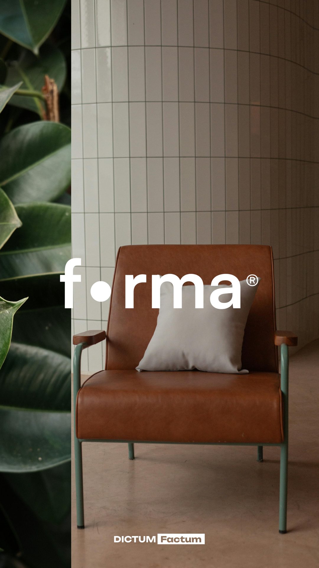
Forma is a furniture brand founded by a Ukrainian designer. The name comes from the Ukrainian word «форма» — which means shape, the foundation of everything that surrounds us.
The Solution
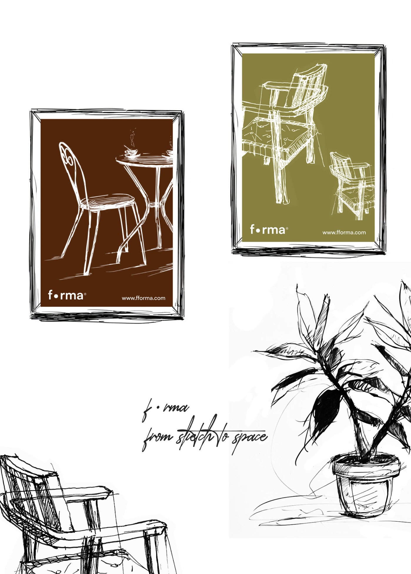
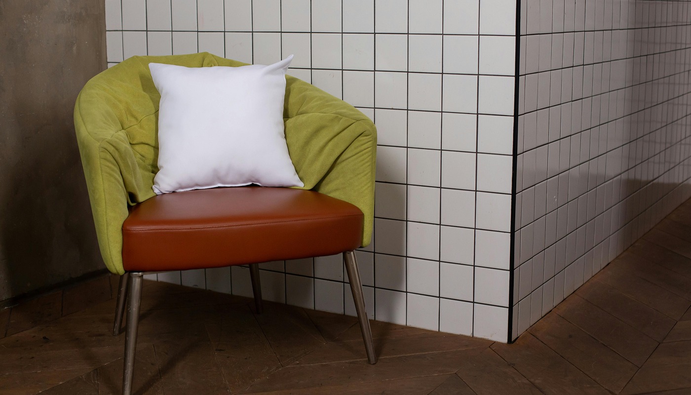
Our visual style combines natural tones, soft lines, and a sense of handcrafted warmth. From the first sketch to a complete interior, Forma celebrates the transformation of an idea into space.