
Aster Filtration
Industrial Branding / Technical Design
The Brief
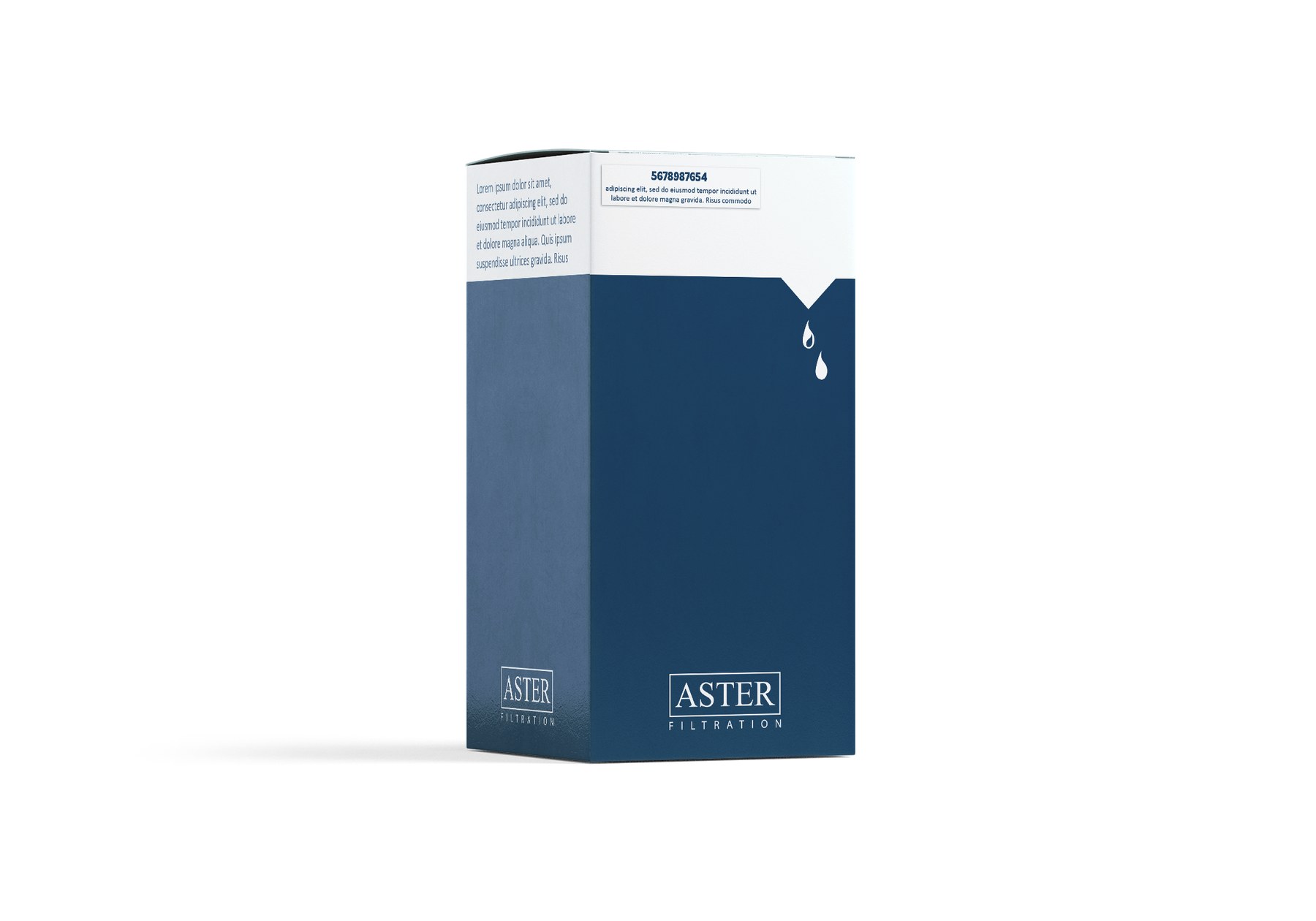
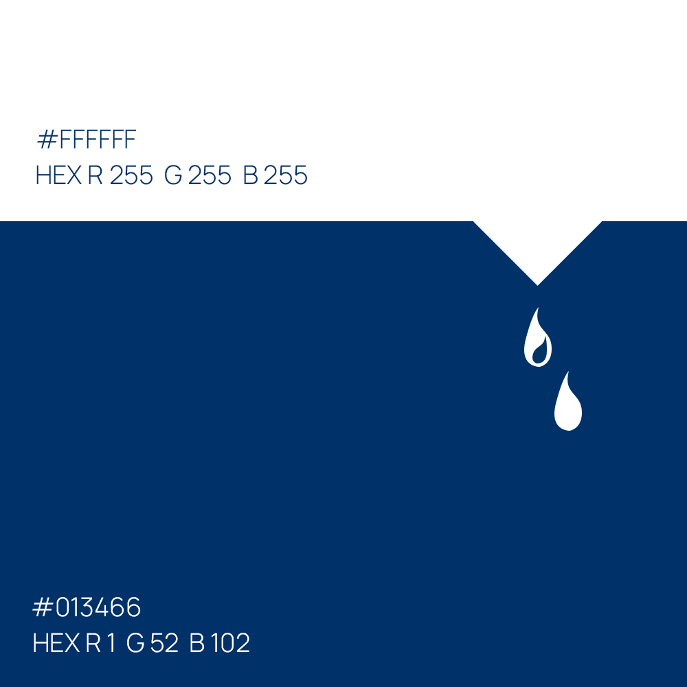
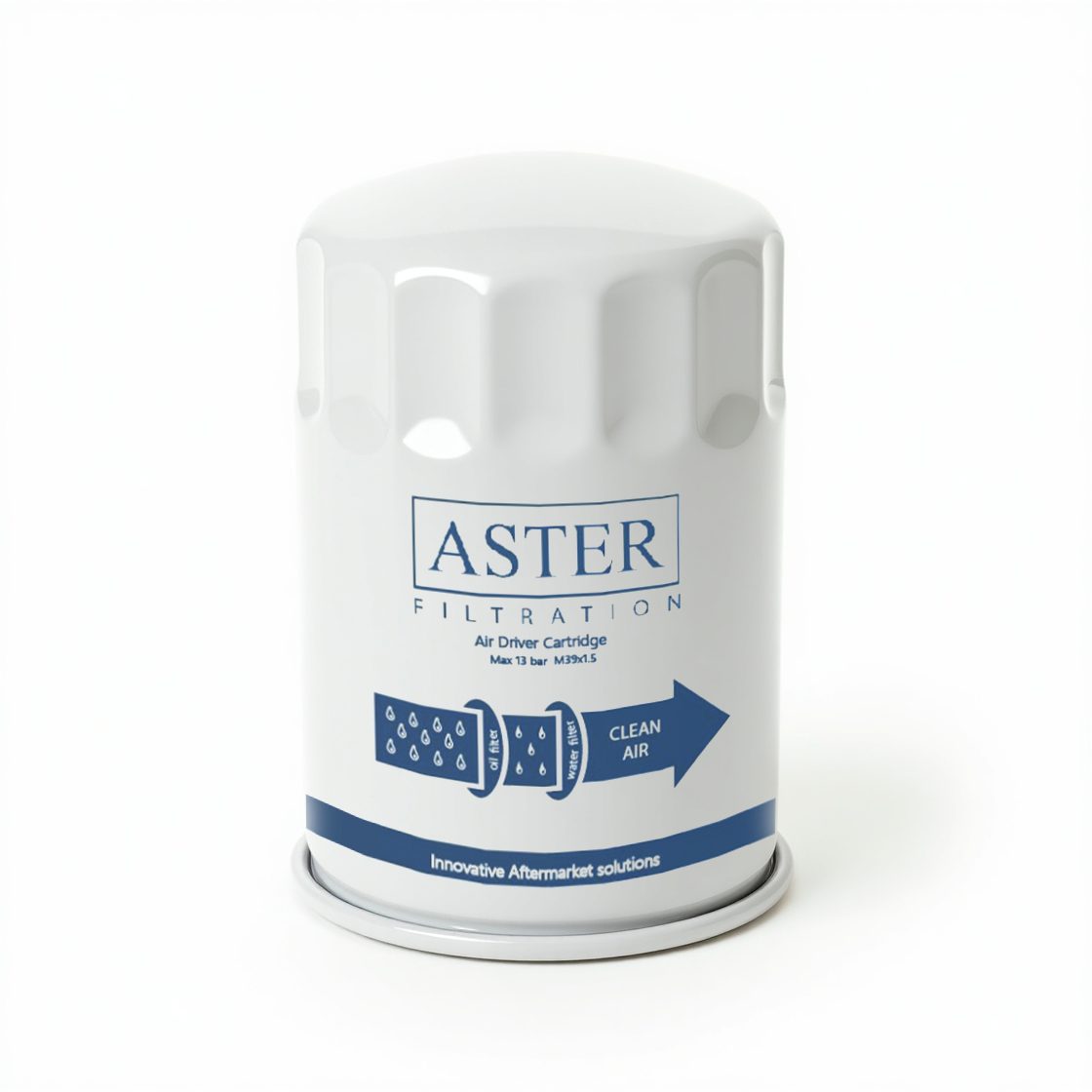
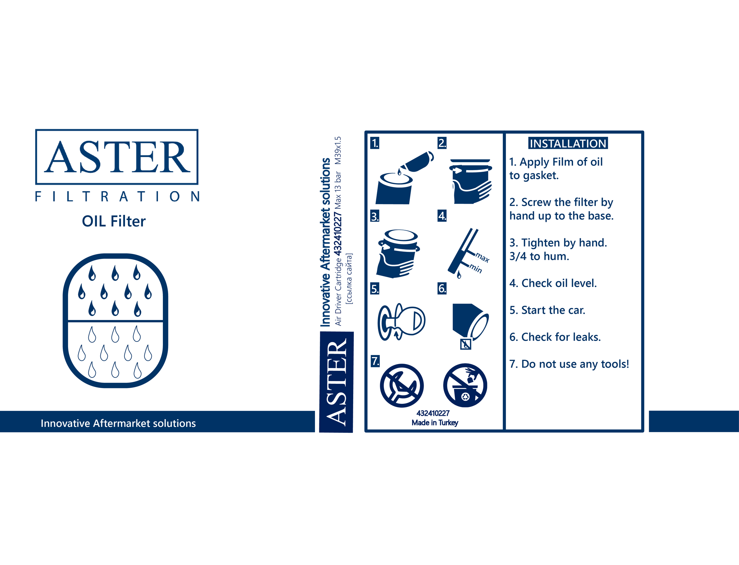
We designed the branding and packaging for Aster Filtration, a company specializing in automotive filters. The filter itself is a car part, and the brand identity focuses on conveying stability and reliability. A deep blue color was chosen to symbolize these qualities, while the logo features clean, straight lines for a classic and trustworthy look.
The Solution
As a distinctive brand element, two drops were included: a white drop representing clean water, and a drop with a glare representing oil. The packaging design is split into blue and white halves, with a small white triangle at the color junction. From this triangle, the two drops emerge, referencing the scoop used to pour oil.