
Kvitka 8
Brand Identity / Specialty Coffee
The Brief
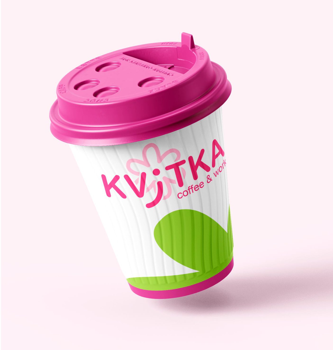
Derived from the Ukrainian word for flower «квітка», the name kvitka8 lays the foundation for a specialty coffee space built around warmth, growth, and community. The challenge was to create a brand narrative that honors this origin while standing out in a crowded, competitive market.
The Solution
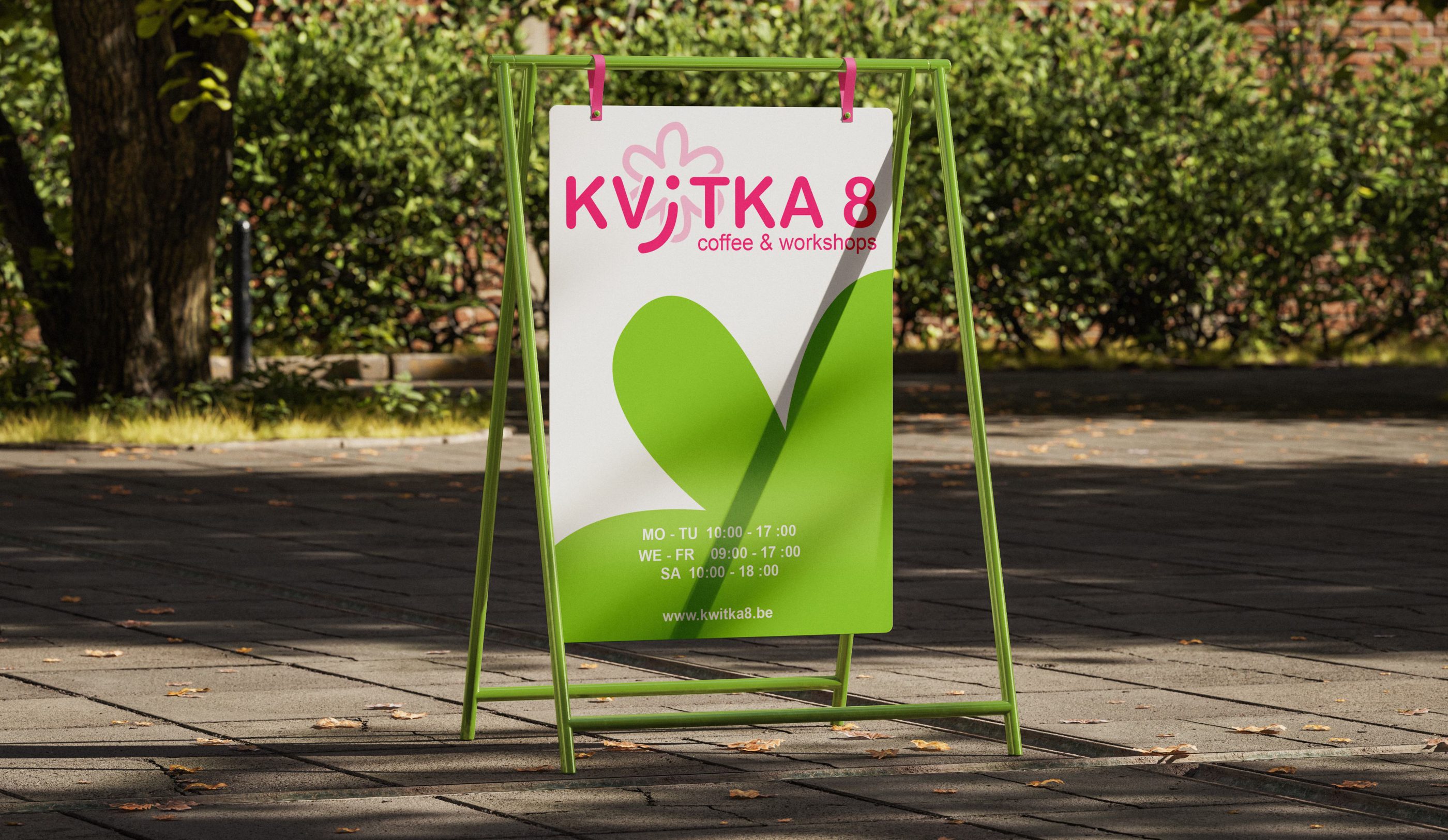
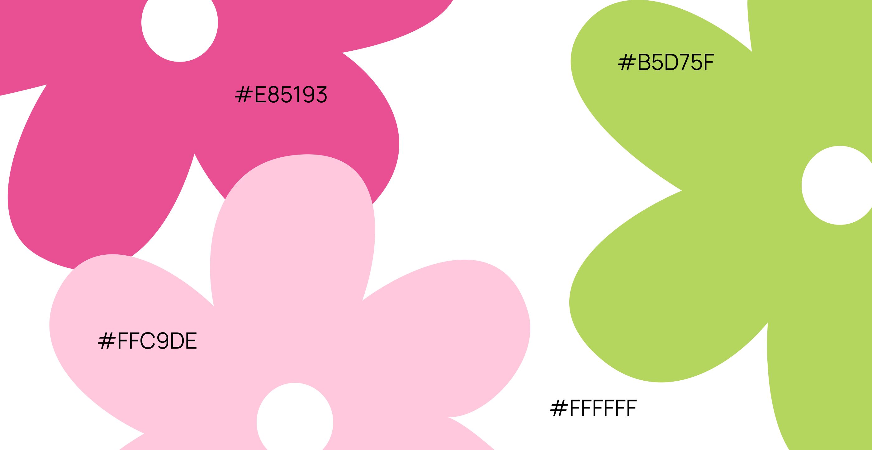
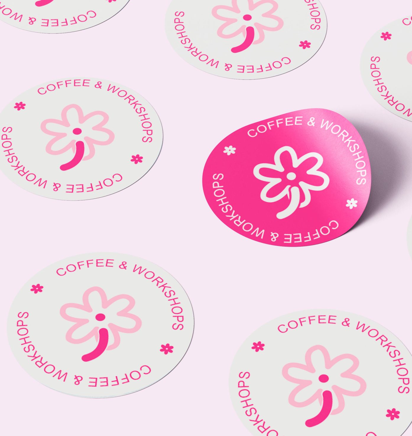
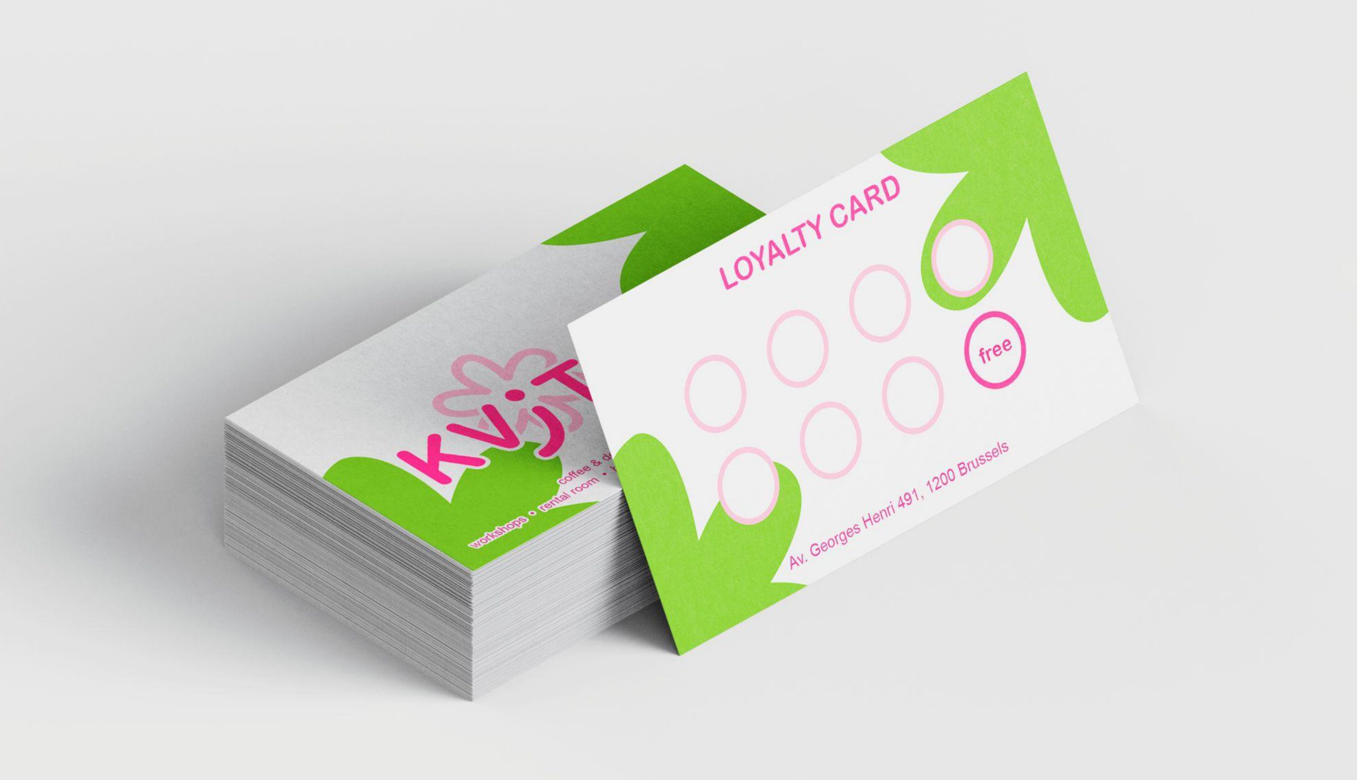
We created a non-literal visual identity that deliberately avoids predictable coffee tropes—there are no coffee cups, beans, or steam icons. Instead, we blended fluid, floral-inspired shapes with modern typography and the rhythmic loop of the number 8, establishing an iconic system that builds strong recognition through mood and character rather than generic symbols.